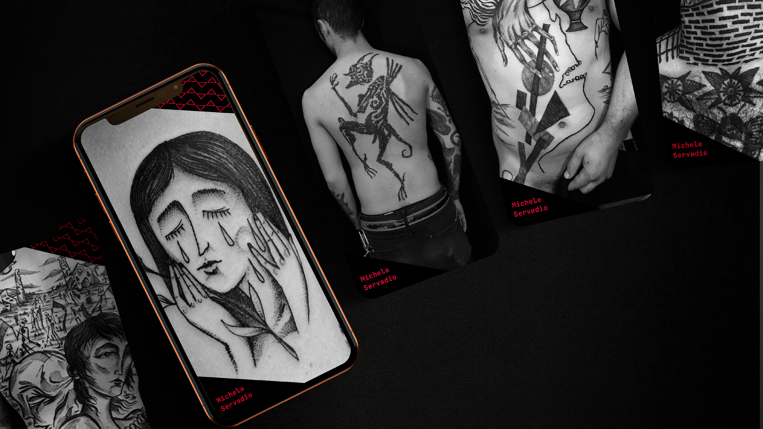
Brand Identity & Art Direction
Agora
Scroll down ↓
In this personal project, Agora Tattoo Studio takes us back in time. Its roots delve deep into the ancient spirit of the Greek agora, where people gathered to share thoughts, passions, and dreams. In this modern sanctuary stories are born, shared, and immortalized in ink. Agora is a hub for diverse cultures, styles, and people who share a common passion: tattoos.
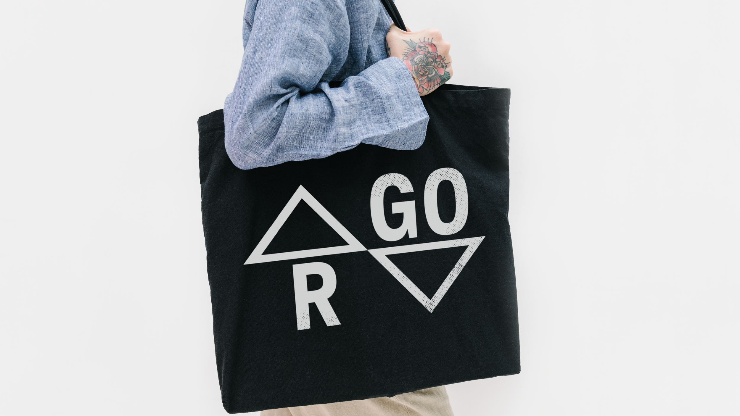
The logo originates from transforming the A's into the symbol of the agora. Much like the agora was located inside the walls, the distinctive element of the studio can be found in the logo, highlighting the studio's specialty.
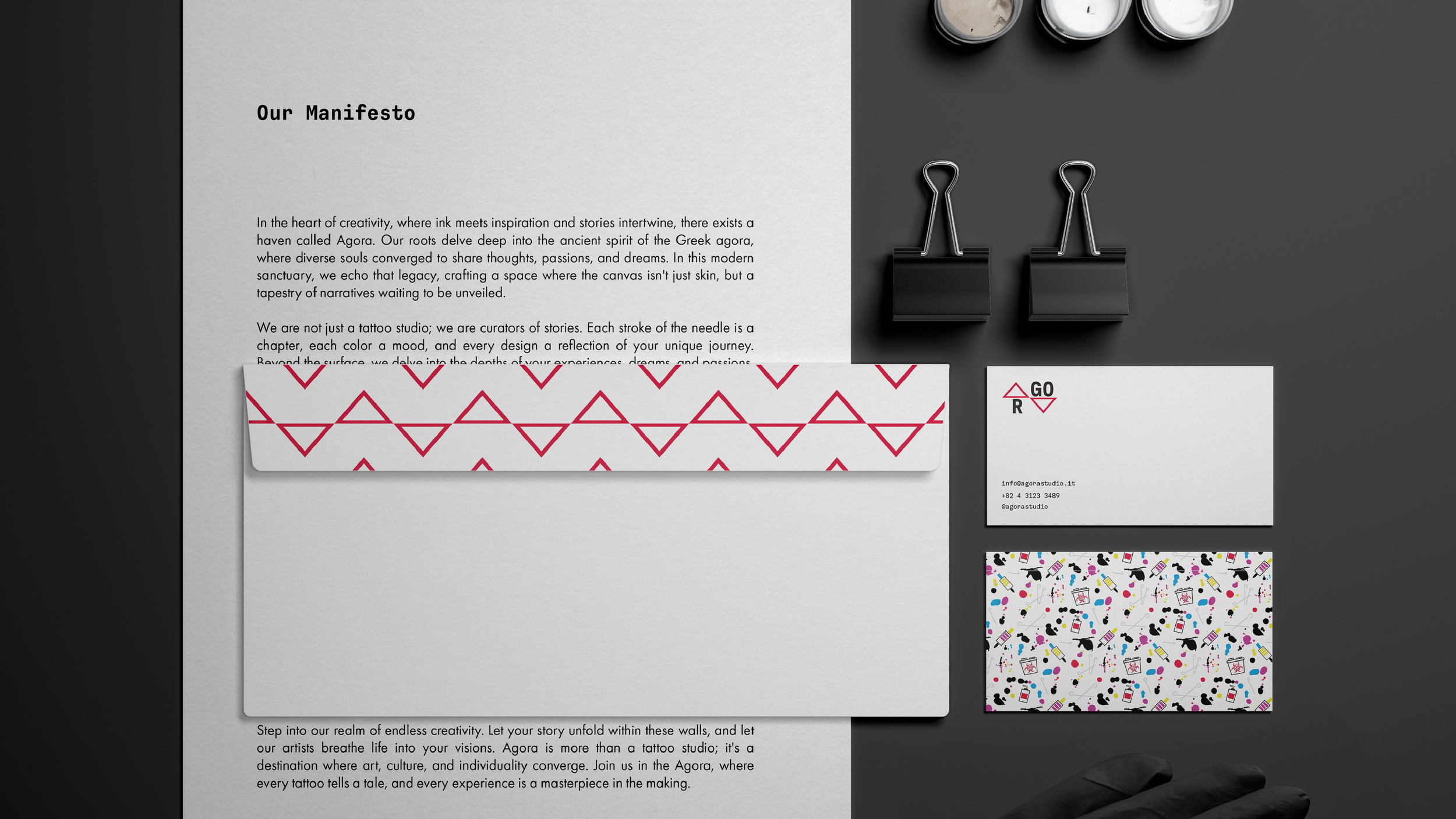
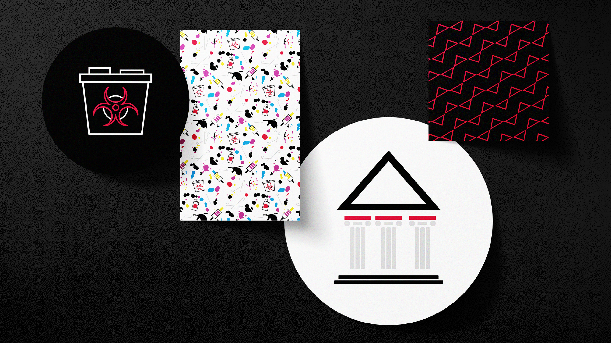
A set of icons to enrich the visual identity. The artists’ tools crafting a space where the canvas isn't just skin. A primary color palette to formally represent the brand, accompanied by three vibrant secondary colors to mix and capture attention.
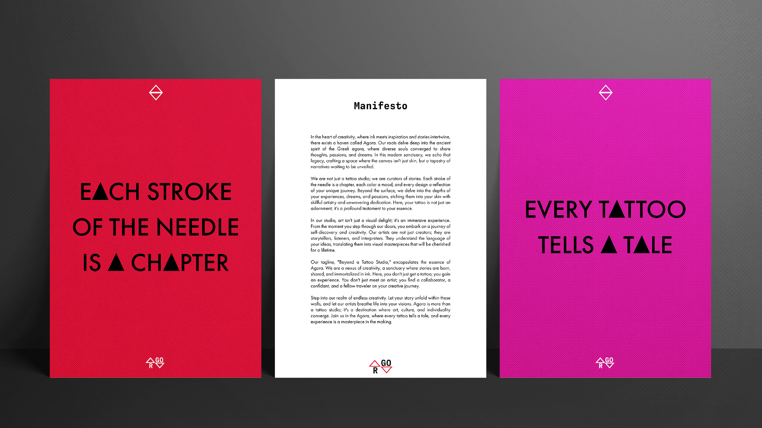
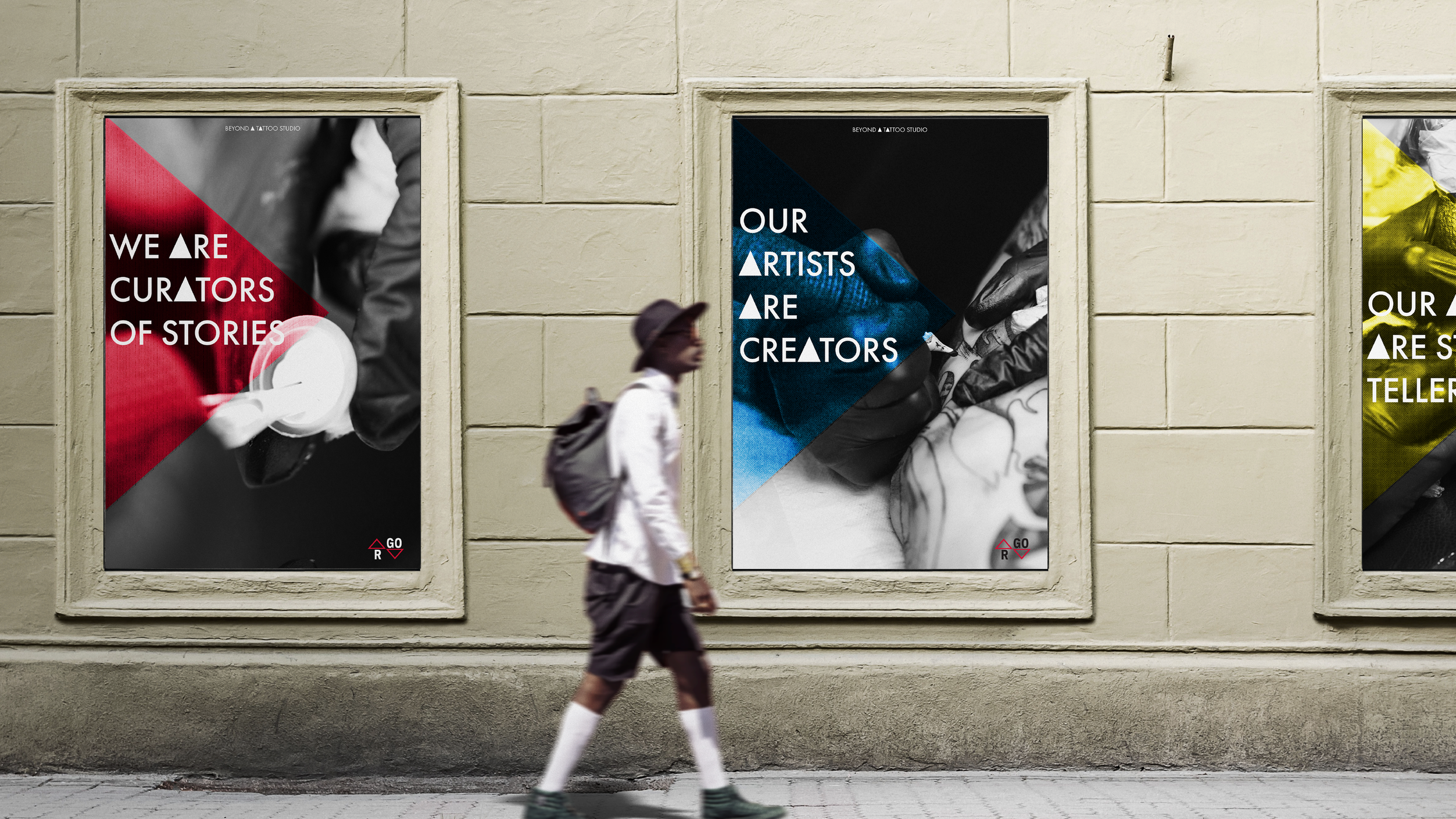
A visually rich language with colors and typography to stand out. The tone of voice leaves the viewer no choice but to remain captivated.
The tagline is “Beyond a Tattoo Studio" because it's an immersive experience. The destination where stories are born, shared, and immortalized in ink.


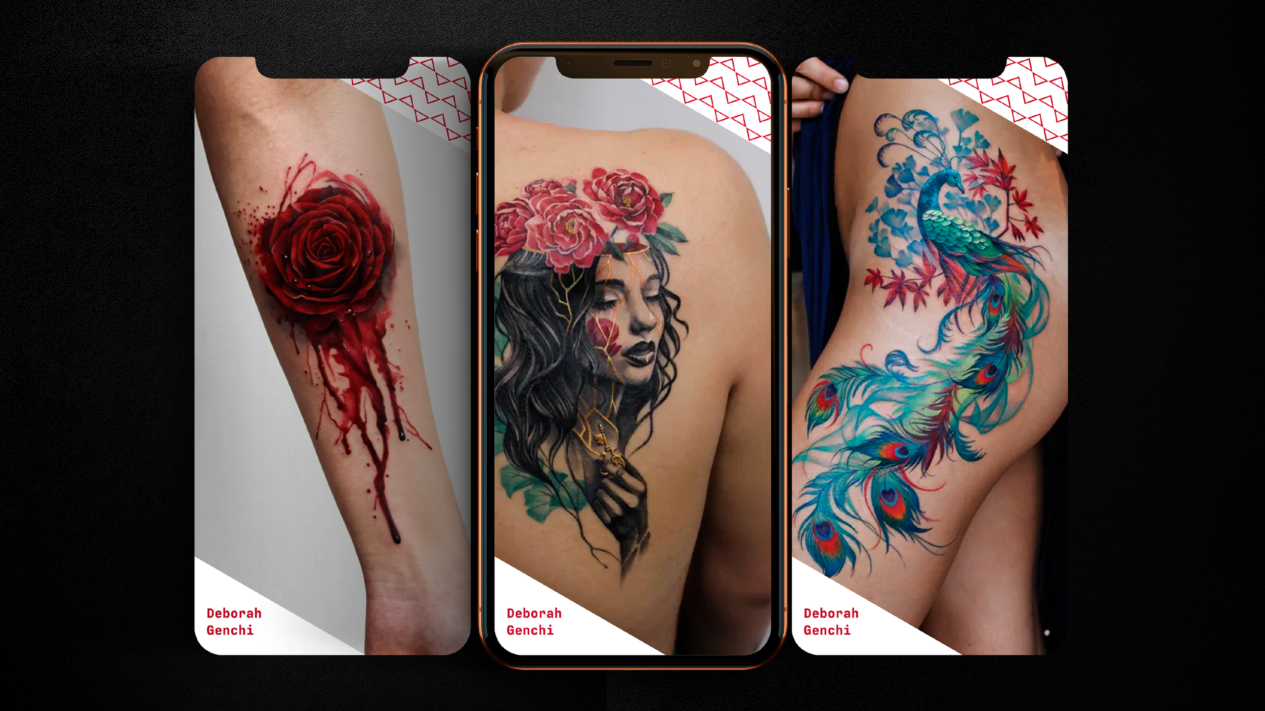

All rights of the artists involved in this project remain with them. The purpose of this personal project is non-commercial.


